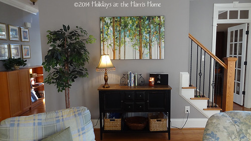
This wall is an awkward wall in our living room, and yet it's turned into an area that is providing inspiration to the rest of the house, really, due to the choices of what we've put here so far.
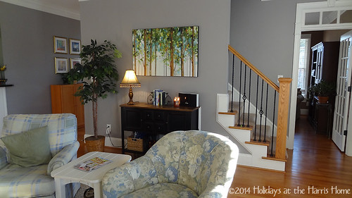
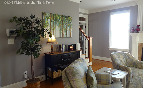
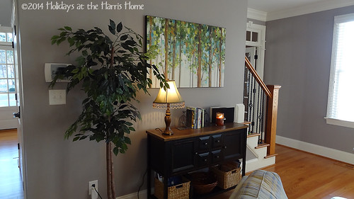
The wall is a sort of pass-through area, leading from the front hallway (on the left), to the stairs that lead to our second floor (on the right). The pass-through goes behind these two easy chairs.
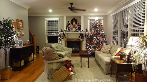
While the fireplace might have led us to have a symmetrical arrangement of furniture, we found that this awkward wall and the wall of windows opposite make it really difficult to find a furniture arrangement that focuses on the fireplace, without forcing traffic to go right through the conversation area to get to the stairs. Here, let me share a photo of the whole room decked out for Christmas so you can see what I mean.
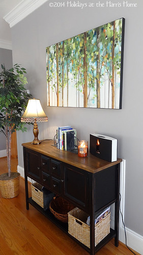
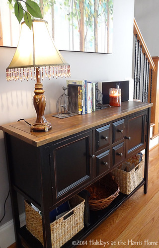
So this arrangement is what we've come up with. But it means that this awkward wall needed some kind of treatment that would serve a function but not be obtrusive in the room. (does that make any sense?) I think this console table and the canvas art piece are just right for this spot.
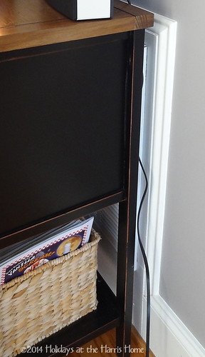
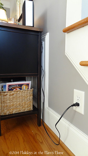
Why would I have done that? Well, the culprit is the air intake vent that is on this wall. It's really large, and for some reason, the builder thought it would be a wonderful idea to frame it out with decorative molding, making it an even bigger eyesore. I have to wonder... why????
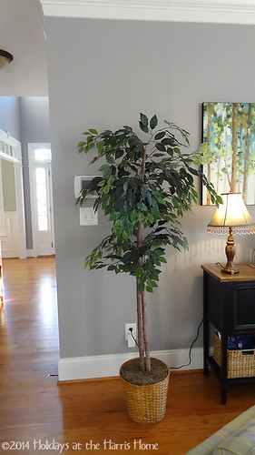
The third and final strange thing about this wall is that we've got a mess of ugly white control boxes, thermostats and light switches hanging out there for the world to see. Right now, my solution to that problem, combined with an effort to make an off-center table look not too off-center, is to put this classy 1990's faux ficus tree here.
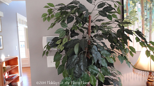
Ok, I know. The tree is not really hiding the mess of ugly. And it's not exactly super-cool to have these trees, especially with the super un-fancy wicker basket that it came with when I bought it a couple of decades ago.
But stick with me here - it does kind of blend with the artwork, right? And it does add some fullness and softness to the room which otherwise is full of cool colors and hard edges. Right? Please say yes.
Well anyway, I'd rather talk about the table and the art canvas.
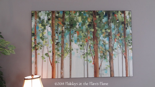
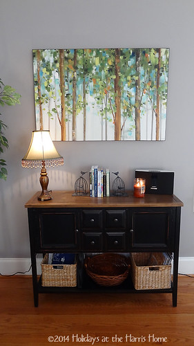
I bought this canvass from art.com a month or so after we moved here. I absolutely love it! I originally bought it thinking that I'd put it over the fireplace. But my husband liked it on this wall better, and I have to admit that I do too. I love the black edges, which tie nicely to the black in the table below. I love the colors - fresh green, teal, turquoise, creams and browns. Very natural colors, I think, and I love the scene of trees that it represents.
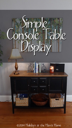
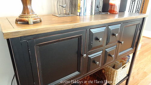
The console table itself is something I searched and searched for. I looked in thrift shops, I looked at every website imaginable. I finally saw this table on Joss&Main, and decided to go for it. I love its size, I love the storage options, and I love the black painted finish combined with the natural wood top.
I like that it has slightly distressed edges, but not too much.
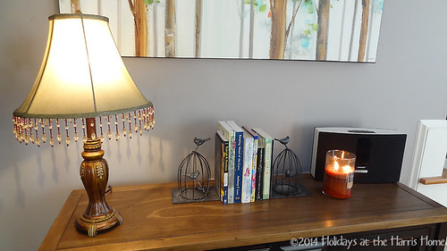
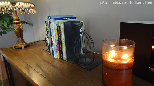
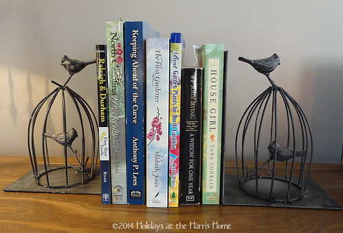
As for the display, there really is not much to it. I am temporarily using a lamp that I had somewhere else, and my new wireless speaker that I got for Christmas from my husband. The book ends are bird cages, each with two birds, that I found in a gift shop in a local store on my first shopping trip out in my new home. The books are local North Carolina guidebooks, gardening guides, or southern writer stories. And a simple homey-scented candle that I received from my son.
Overall, I'm pretty happy with this little spot in the house so far. But I'm far from finished.
In the coming months we hope to paint the walls a warm neutral beige. The grey walls are clean and fresh, but a bit too cool for our tastes. I also plan to try to make slip covers for the two chairs. I love the chairs themselves, and I do love the yellow, green and blue plaid, of the one chair. But neither fabric really matches my vision for this room anymore, so slipcovers it is.
I've ordered a new sofa which will have a deep brown velvet slip cover for winter and then a light twill slipcover for summer. We'll get some kind of window coverings eventually, and I'll find a coffee table that I like. I'll paint my thrift store end table black similar to the console. And then with some more blue, green and turquoise accessories, we'll be well on our way to the comfy, warm, textural room that I have in my mind.
How about you... how have you dealt with an awkward wall in your home? What are your plans for decorating after Christmas is over? I'd love to hear about it! Please leave a comment to share your thoughts.
Thanks so much for visiting!
__________________________________
Linking to:
Stonegable's The Scoop
A Stroll Thru Life's Inspire Me Tuesday
We Call it Junkin's History and Home
The Golden Sycamore's Inspiration Gallery

I'm just getting ready to redo my awkward front entry area, which I use as a bar for parties. No one comes in my front door anyway -- everyone comes in the side door to the kitchen. I have realized that I need a much larger mirror or a grouping of mirrors and I need to keep it pretty simple so that I don't have to move a lot of stuff to put up the bar. I love that you are sharing your work in progress; it gives us all hope for the future!
ReplyDeleteThanks for stopping by Jennie. It sounds like you have a tricky spot to deal with too. I love the idea of a grouping of small mirrors above your bar. That sounds like it could be just the thing. Hope you'll share your work in progress too as you go along!
DeleteI think you did a great job, I really didn't see the thermostat or the air return until you pointed them out. That console is a great piece! The artwork is fabulous!!! Thanks so much for sharing this at my History & Home link party. I hope you join each week, loved having you. Take care - Dawn @ We Call It Junkin.com
ReplyDeleteThanks Dawn! Hope I'll have something to link each week!
DeleteJust a tip - I got several really inexpensive small carpet dots
ReplyDeletethe other day and attached them to the bottom of the feet of my dining area chairs.
No more scraping over the floor when our daughter
uses them as a walker!
my site; Oliva