
Today we're spending some time in the Bonus Room of our house. This is a large room above our garage that serves as our TV room.

The room has been pretty neglected, decorating-wise. It's brown, brown and more brown! But here's the challenge of today: After taking down the Christmas decorations, the large media center needs some styling help.
 |
| Not only is it large and empty, but the light is burned out in the top right side too. |
Frankly, I've had a problem with styling this piece of furniture since we bought it more than ten years ago. I've never really had a good plan for these shelves, and it always ends up either too empty or strangely filled with random stuff that doesn't really make much sense to me.
One problem is that there are some electronic components that live on the shelf above the TV that need to be hidden yet accessible. Another problem is that the side shelf units are really deep and really dark. Anything that gets put inside these glass cabinets usually just disappears into the dark caves. A third problem is that there's a glare on the glass doors, and that makes it even harder to see anything inside there. Here's what this media center typically looked like when we lived in Maryland:
 |
| The media center didn't look any better when it was in our old house in Maryland. |
To further complicate matters, the two other bookshelf-type units in this same room are very similar in style. So whatever I do in the TV media center, I want it to blend but not be too similar to these other units.


Help!!!!!
To get some inspiration for decorating this challenging area, I turned to houzz.com. Here are some photos that came up in my search.
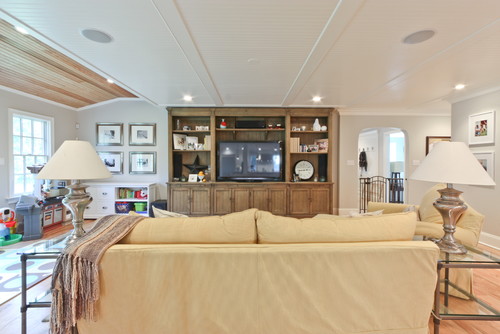
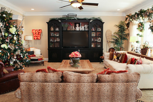
This media center is kind of similar with a big center section and two side shelving units. There are no doors here, and so the items in the side units are easier to see. Should I remove the doors from ours? I also like the large scale items on the lowest shelves... I could remove a shelf in our unit to get a similar look.
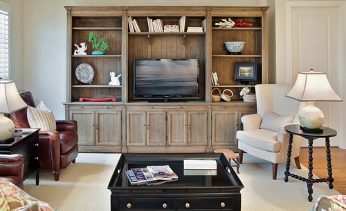
The same media center unit, used in a different house by a different designer. This shows how the same unit can have a different look just by changing the shelf height and using different elements.
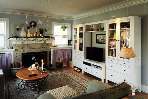
This unit has doors, but the cabinet is white inside so the items behind the doors are more easily seen. Lots of books in this display, something we could very easily do in ours.
Here's a sparsely filled bookshelf example. The shelves are very dark, so they used lighter colored items in the shelves. No glass doors... I'm really tempted to remove our doors!
I like the way the shelf above the TV is styled here... this idea could be very easily copied in our media center.
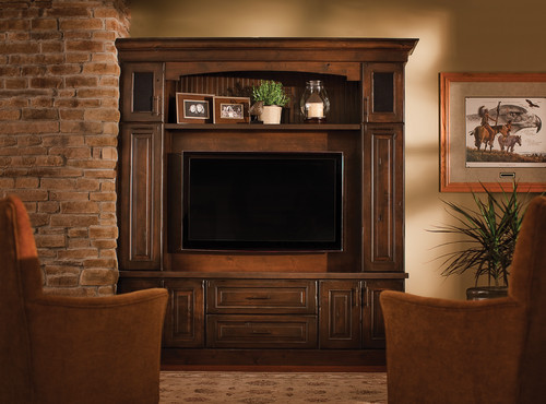
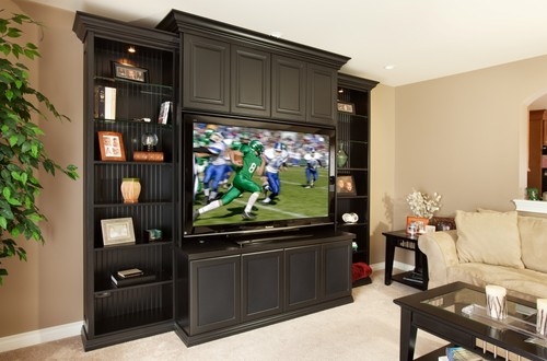
This is another dark colored media center, and this one also has glass doors like ours. In fact, this one is really similar in style and shape to ours. For some reason, I'm not a big fan of the large scale photographs in the shelf above the television. The side shelves are nice, though, so I'm sure we'll end up with 5"x7" photos on some of our shelves.
I'm going to think a little on this, and be back in a few days with an update on how I addressed this challenging decorating situation. In the meantime, do you have any ideas for me? I'll use all the help I can get!
________________________
Linking to:
Between Naps on the Porch: Metamorphosis Monday
A Delightsome Life - A Return to Loveliness
StoneGable - The Scoop
Linking to:
Between Naps on the Porch: Metamorphosis Monday
A Delightsome Life - A Return to Loveliness
StoneGable - The Scoop
No comments:
Post a Comment